Alt Legal - animated website elements
01.
Project Overview
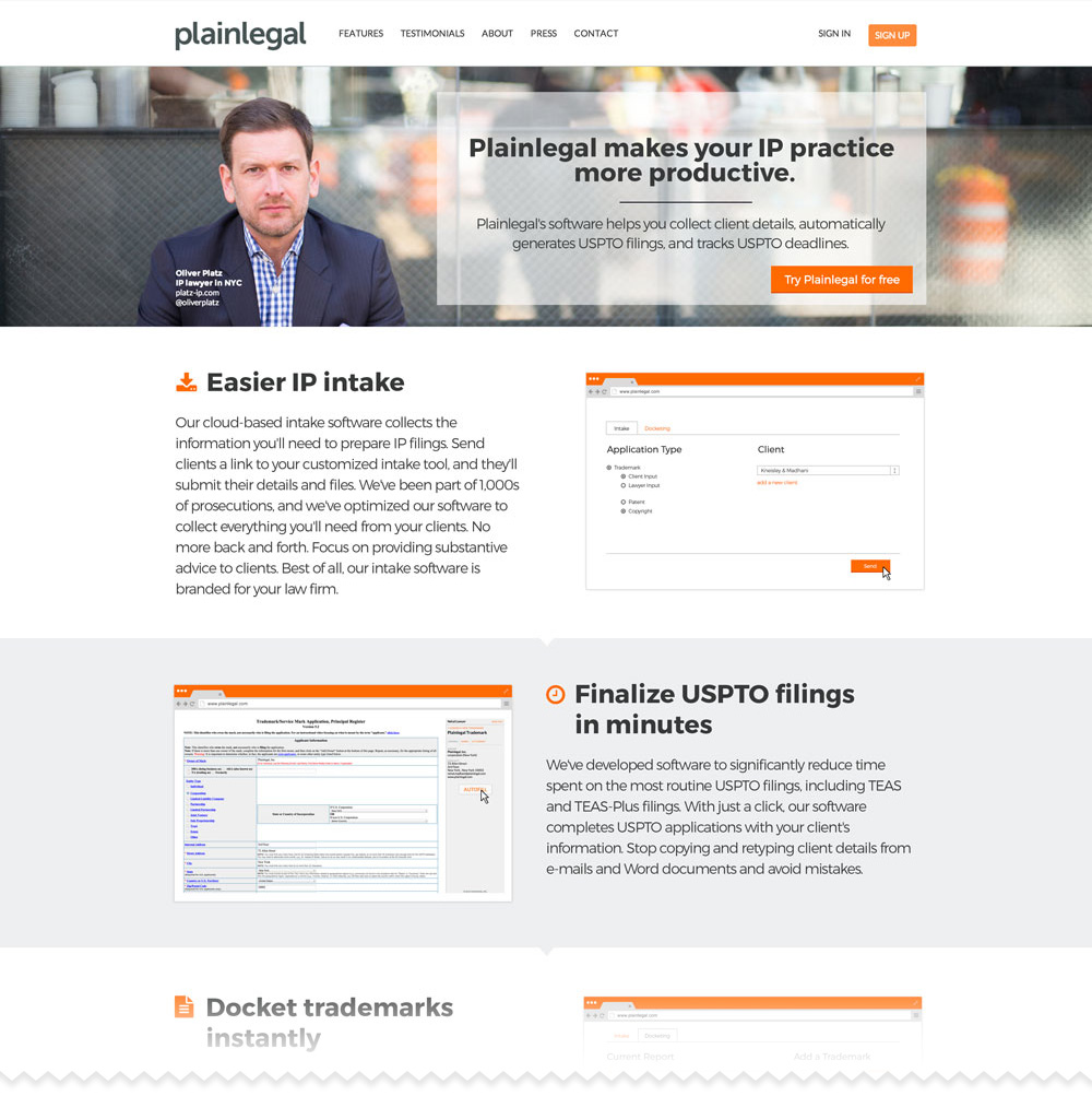
Alt Legal, a legal tech startup based in NY was looking for ways to improve their product communications on their website. Our conversation initially started about building an explainer video that would explain their product value proposition, however after doing their website analysis we agreed that a more effective solution was to create a number of smaller animations to improve overall product presentation on their website.
Note: since our initial production Plain Legal has rebranded to Alt Legal so some of the visuals below might not reflect their current brand identity.
02.
Our Approach
The first thing we did was reviewed their website and suggested a number of tweaks to clean up the layout and make sure it was better suited to integrate our animations.
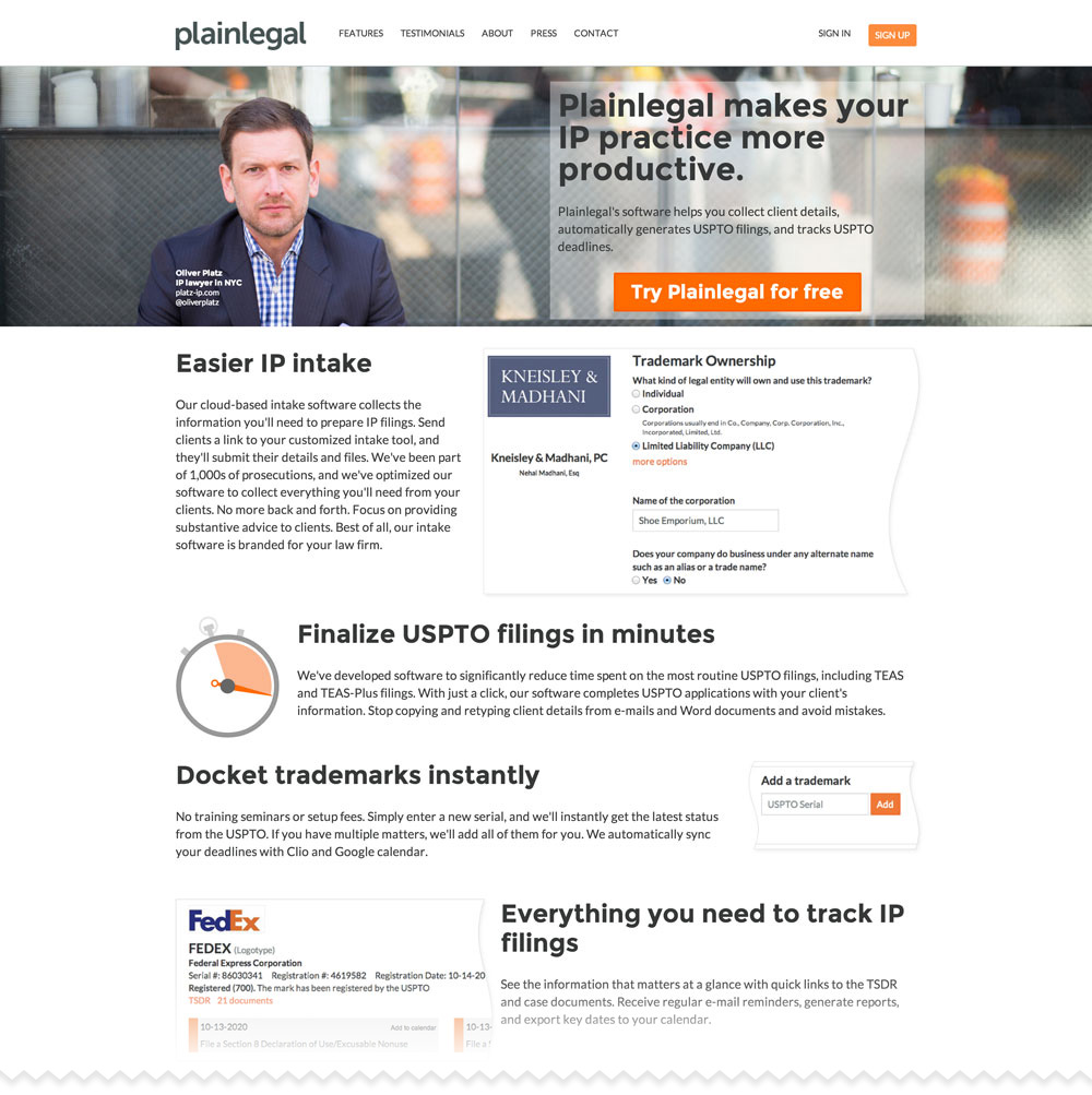
Original website design
Here’s some of the issues we saw with this design:
- Header call to action copy wasn’t spaced well making it hard to read.
- Feature descriptions were cluttered together.
- Feature images were inconsistent - some were product shots, while one was a graphic.
- Feature images weren’t very informative.
03.
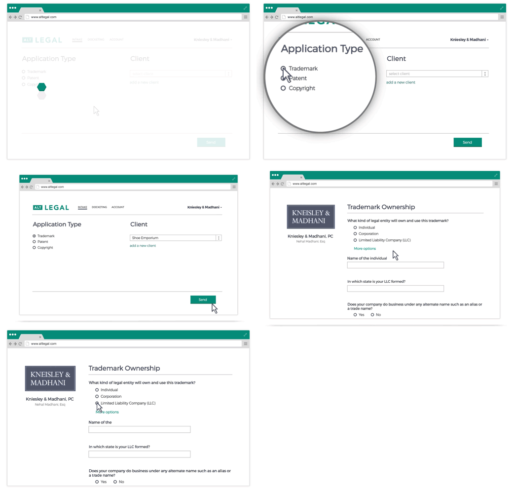
Animated Feature Gifs
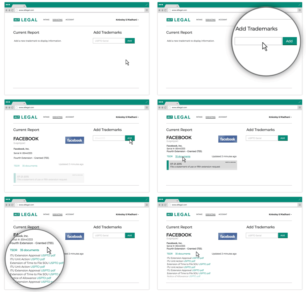
Here’s a couple of animated gifs that were created to explain various product features. To make them easier to read at this small size we even simplified some of their product UI. In the left example it can also be seen how we added some titles and motion graphics elements to show user submit a form and how its displayed for the legal firm.
To make the experience even more streamlined developers at Alt Legal added a feature where product demonstrations didn’t start playing till the user scrolled down to a particular feature.
Get in touch to see how we can help
with your next project!
Get in touch!
Contact Details
South Eleven
Suite 5203 - Unit 1
77 Sir John Rogerson’s Quay
Dublin 2
Ireland
Enquiries: contact@southeleven.com
